Introduction
LocalSend is an open source app for securely sending files between devices on the same local network without needing the internet.
Problems
- The Receive Page is redundant.
- Too many buttons without captions create confusion.
- The current color scheme clashes with MD3 standards and frankly looks bad.
- Shadows are inconsistent and distracting.
- The Navigation and Status Bar are opaque.
Changes
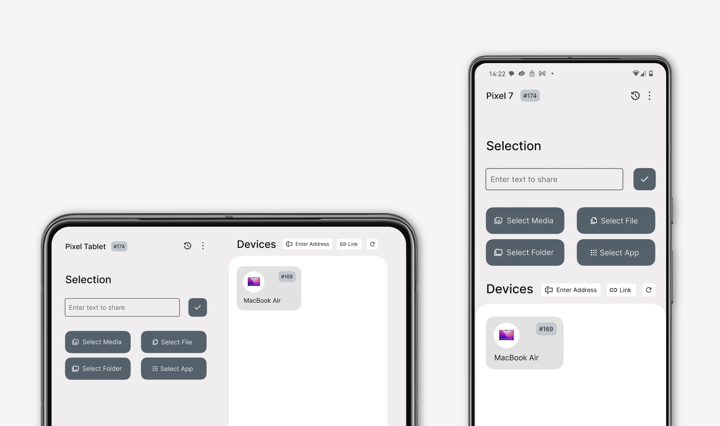
- Home Page: Combines Share and Receive page in a simplified layout. The "More" menu includes Device Info, Settings, Troubleshoot, and Help.
- Improved UI: Larger buttons for one-hand-friendly use. Better MD3 components with a neutral blue color. A text box for sharing text with a confirm button.
- Relocated Settings: Single/Multiple Recipient Setting moved to the Settings menu.
- Navigation and Status Bar are now transparent.
- History button added to the Home page. Expressive device icons that serve as OS identifiers. A refresh button that works for both WiFi and Hotspot.
- A 2-column grid for better space utilization.
This redesign aims to improve Localsend's usability and aesthetics, making it more user-friendly and visually appealing. I created a Github issue for the same.